
TLDR; Testing responsive web does not mean test it on lots of devices and browsers. Look at the risk associated with your technical implementation and test those. You might still have to use lots of devices and browsers. After reviewing various chrome extensions, I use the Chrome built in functionality for visualising media queries.
When you test your web application, do you differentiate between “Responsive Web Testing” and “Cross Browser Testing”?
What is Responsive Web Design?
I think people still argue about “Responsive Web Design”.
I use the term to mean how the website responds to different rendering environments.
You can read more about responsive web design:
For my purposes here, I’m going to say that Responsive Web Design is responding to the size of the screen. This might be done via CSS or JavaScript or server-side based on browser headers.
So, how do we test it?
How we we test depends on how it is implemented
Very often I find people test on multiple devices because their organization has chosen to ‘support’ those devices.
And that’s it.
Different implementations expose us to different risks. And therefore… different test approaches.
“Cross Browser” Testing
Often the risk decision making criteria comes down to “we need to test it on this device because we want to say we support this device”.
The decision about ‘what’ to test on the device wasn’t based on the risk that the device presents. It was based on the risk that the marketing might not be accurate.
Issues with this strategy?
- It will take too long, we have to test ’everything’ on each of the devices
- it still leaves us exposed to technical risk on devices that don’t come into scope.
If we take a technical decision about risk mitigation then we might stand a chance of reducing testing scope and therefore the time it takes to test.
We should look at the implementation approach to understand the risks around it.
Risk of Media Queries
Media Queries have been around for a long time.
Can I Use reports a pretty high browser support percentage for media queries. (How accurate is this? I don’t know!)
All of this, I could take to mean that CSS media queries represent a pretty low risk ‘responsive’ strategy.
But clearly it depends on what parts of media queries we use:
And if the media query itself is ’essential’ to the site or application.
If it is essential that the functionality implemented using “hover” works then you probably want to make sure that Firefox and IE are part of your test browser environment, if you use “Can I Use” as your risk assessment tool, since “Can I Use” reports Firefox and IE 11 as having issues with CSS Hover. Your use case might actually work, even if the browsers are not viewed as completely compatible. (Certainly I use ‘hover’ on my web site and I haven’t seen any issues with the hover on Firefox and IE.)
Cross-browser becomes important and viable when we have an identified risk with that browser platform.
If we ‘architect’ our applications to reduce risk then that provides an even better risk mitigation strategy than ’testing’ since we can choose implementation solutions that are low risk.
Regardless… technical decisions around implementation can guide our testing.
Other than ‘platform’ implementation what else do we take into account?
Media Queries create screensize breakpoints
@media only screen and (max-width : 1290px) and (min-width : 1051px) {
   /* Medium desktop: 5 tiles */
   .thumbCell {
      width: 20%;
      padding-bottom: 20%;
   }
}
I took the above media query from the CSS used on one of my sites.
The above query gives us a couple of breakpoints to work with and use those in our testing.
How could we test those?
- choose devices that cover those sizes
- resize the browser
- use a responsive test tool with iframes set to those sizes
- use the browser dev tools capabilities e.g. Chrome’s Device Toolbar
Are there risks in choosing one strategy above another?
- What if we test on device but it doesn’t report the size we think it should?
- What if we don’t have devices of the right size?
- What if there are bugs in the tools we use?
- what if the browser has bugs?
So many risks.
But really.
- if the device implements the standard for media query screen sizing
- if the browser sizes properly
- and assuming that the CSS validates against the standard
- W3 CSS Validation Service
- Charles proxy uses the above service to validate CSS
- Total Validator will also validate CSS
- and that the CSS validator validates correctly
Do we really need to check the media query on a device?
If you think so, then what additional risk did you identify that you will focus on with your testing?
Responsive Web Testing vs Cross-Browser Testing Summary
- Use Cross-browser testing to target specifically identified platform risks.
- Use responsive testing tools and browser features to target specific responsive web design standard features.
- Validate your CSS
- Find multiple trusted knowledge sources to help you assess risk
Tooling to test this
Are there any good tools for helping me with responsive testing so I can see what media queries are used in a page and then resizing to that resolution for testing?
At UKStar I was speaking to Angie Jones and the topic of responsive testing came up, being able to see your site at multiple resolutions for different devices would be a very useful tool to have.
Also, when I think about this, I want to have very specific application view i.e. what resolutions have I actually coded for, to make sure I trigger the different combinations - not just the general device rendering.
Where would I find this functionality?
- What do I believe I need? To see and easily resize browser to the media query breakpoints.
- Why? Because I want to cut down the amount of device testing and for CSS the different breakpoints can introduce different CSS via media queries.
- How would I use this?
- easily review media queries and see if they match device sizes
- check the query split does it make sense
- are there any missing break points that could be added to make rendering better on different resolutions
- Where do I think I will find this?
What if the browser did this already?
My initial thought was that I should look for a Chrome extension. And indeed that is what I did. The rest of the blog post covers that investigation.
After having performed this investigation, found an extension, fixed a bug in the extension, I realised…
“I wonder if the browser does this already?”
I should have started here.
Given my existing tool set, can they meet my needs?
Chrome Media Query View
In Chrome.
- Toggle the Device bar
- Show Media Queries
- Use media query rendering bars
Toggle The Device Bar
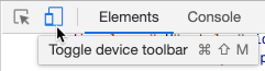
This will show the responsive view
Show Media Queries
Click the “Show Media Queries” menu:
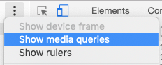
This will show a rendering of the Media Queries on the site
Use Media Query Rendering Bars
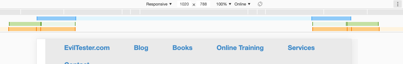
This shows me the media queries that are active on the page and I can:
- click on these to resize screen to see the effect
- right click to see where the css breakpoint for the media query was defined
Chrome extensions
I would have had a more productive morning if I had performed this step first, but I didn’t, I did it after I looked for Chrome Extensions, Evaluated Extensions, Fixed a Chrome Extension… as you will see.
How do I think I will find an Extension to do this?
Extensions are generally released to Chrome Store
- view media queries
- responsive css breakpoints
But I’m also aware (since I have tried to submit two extensions to the store, but only one has been accepted) that there are other extensions available as source that might be better, but I won’t know about.
But I’ll try the search and the “Related” suggestions from the store first.
What came back?
A few products came back and after reviewing the descriptions I reduced the list to:
- Responsive Inspector
- Emmet Re:View on chrome store
- SeeResponsive
- Responsive Inspector Reloaded
Last time I reviewed them on 20220319, only Emmet still worked
Responsive Inspector looked like it matched my requirements pretty well.
Emmet Re:View matches some of my requirements but looked like it might offer a potential time saving time of showing all the different sizes at the same time.
SeeResponsive looked like a light weight version that might support fast switching.
I revisited each of the extension pages to check the “related” list at the bottom of each extension page to see if that helped me find additional tools.
There were a few tools that seemed interesting but because they used ‘hard coded’ sizes they didn’t quite match my need of targeted risk assessment for the current system. They were more suited for generic web development support and I could achieve much the same result with the in built chrome responsive view and its predefined device list.
The ‘related’ view found “Responsive Inspector Reloaded” which is a forked version of Responsive Inspector which hasn’t been updated since 2013 and the comments on Responsive Inspector Reloaded suggest that Responsive Inspector doesn’t work on modern browsers.
Try Them
I tried Responsive Inspector Reloaded and it didn’t work as I expected, perhaps this doesn’t work on ‘modern browsers’ since it hasn’t been updated since 2017.
I tried Responsive Inspector and as the comments on the Reloaded version suggested, it didn’t work on my up to date browsers, failed with the same user experience as Reloaded.
I tried SeeResponsive, and that gave an error loading the CSS on my page. I tried it on another page and it functioned. It didn’t give the user experience I was expecting so it isn’t suitable for my needs.
I tried Emmet Re:View and the Device Wall is interesting but not as configurable as I expected. And the Breakpoints view doesn’t show me the breakpoints in the page. I might still use this for exploratory testing because it shows me a range of sizes and I can interact with them at the same time.
Extend Them
Danger: if you know how to code you might fall into the trap of trying to write something that already exists without fully exploring all current options. I almost did.
I had a quick look at the Responsive Inspector Reloaded code.
Now that I’ve built Chrome Extensions I have some familiarity with looking at the code.
Rather than ’try to make it work. I decided to pull out the essence and see if I could get it to work. The main code was a single method in the content.js called getMedia
I found an exception was thrown in the code.
A web search later and I found a suggested try catch block fix.
This is because various security measures have been added to Chrome since the extension was written and now, when a trying to access details of a stylesheet from a different domain, an exception is thrown.
Wrapped try catch and the code worked.
Fix it
I downloaded the source from the original github repo to run as an unpacked extension.
I added the Try Catch in the getMedia method in the extension and it worked.
Well, almost. The screenshot functionality didn’t work but the at least the pop up menu now showed the media queries.
Someone had raised an issue on the main project for this defect:
https://github.com/MistaTwista/Responsive-Inspector-Reloaded/issues/2
So I added a comment with my fix.
The next step would really be to add a pull request with the fix.
But I’m not going to do that, because… while I think the extension is useful, I will probably just use the built in browser functionality.
If I was going to fix it I would start here to learn about forking, fixing and pull requests
Free Video Inside of Chrome Functionality

Emmet Re:View
- Emmet Re:View on chrome store
Emmet Re:View matches some of my requirements for responsive testing but mainly it offers a potential time saving time of showing many different sizes at the same time.
I wrote a crude tool many moons ago for responsive layout testing - it uses iframes and is a bit clunky.
Emmet Re:view runs as a chrome extension and can show a page as multiple sizes at the same time.
You can configure the set of renderings used.
And the page is scrolled at the same rate so you can see much of the same content in each view at the same time.
Unfortunately I couldn’t get the media query breakpoints view to work, but the multiple rendering view is useful enough to consider using this plugin for.
Emmet Overview Video
